
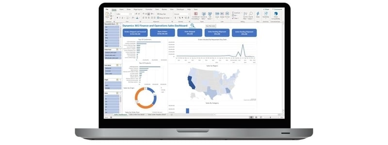
With Excel add-in you can bring in and build a dataset and then build multiple reporting visuals from that dataset to produce amazing interactive dashboards connected directly with the ERP. Below is an example of a sales dashboard that I built in Excel and connected to Dynamics 365 Finance and Operaitions.
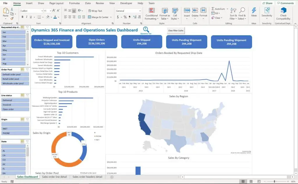
The dashboard contains multiple visuals and summary totals all connected to slicers that control all visuals on the dashboard. These are all connected to pivot tables derived from a main dataset which is made up of a few D365 Finance and Operations standard data entities.
This was all done without a single line of code being written and without purchasing a Power BI license.
If you would like to download this dashboard, as a starting point or to use it as is, you can connect it directly to your environment, refresh it, and see what your data looks like in this dashboard. You are free to add, remove, and modify it as you wish.
Dashboard Instructions And Setup
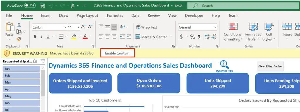
Click “Enable content”. I have built in a macro that will automatically refresh all the filters with the new data you bring in.
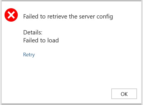
You will receive an error message at first saying “Failed to retrieve the server config” this is because you have not entered your environment “Server URL”. You can just click “Ok”, because we will enter that in subsequent steps.
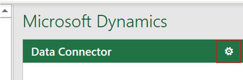
Next, we need to connect the dashboard to your D365 Finance and Operations environment. To do this use the Microsoft Dynamics Data Connector pane on the right hand side and click the gear icon.
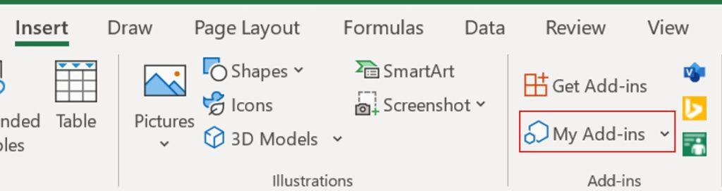
The data connector pane should open automatically but if it does not, you can use what you have learned in this article and click the “Insert” tab in the Excel ribbon, click “My Add-ins”.
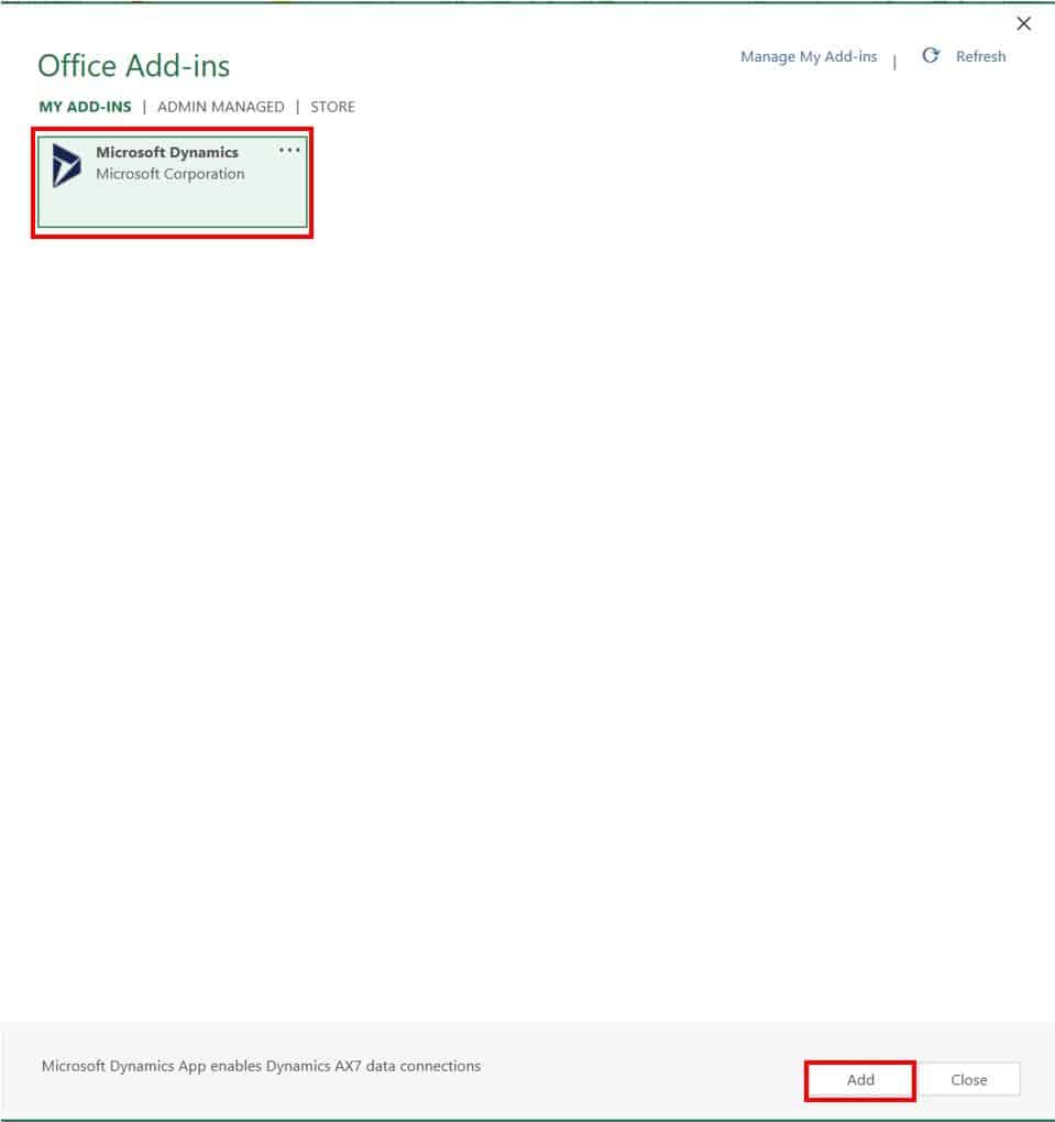
Next find the “Microsoft Dynamics” add-in and click “Add”.
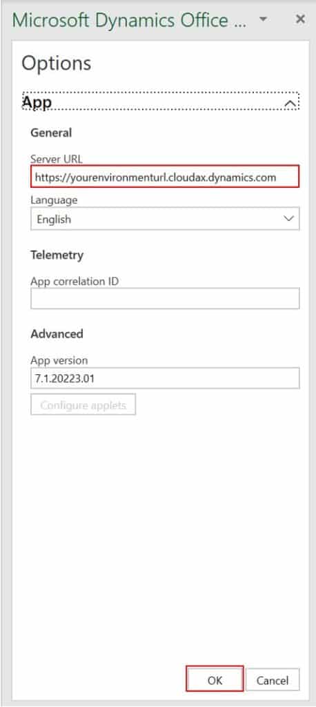
Now you should see the connector pane. Click the gear icon. In the “Server URL” enter the URL for your environment and click “Ok”.
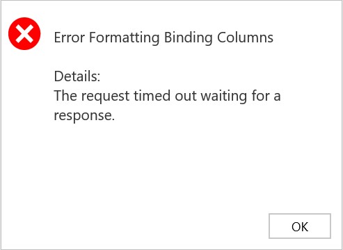
This will connect to your Dynamics 365 Finance and Operations environment and the spreadsheet will begin to populate with data. If you receive an error message saying “The request timed out waiting for a response” just click ok and press the “Refresh” button in the data connector again.
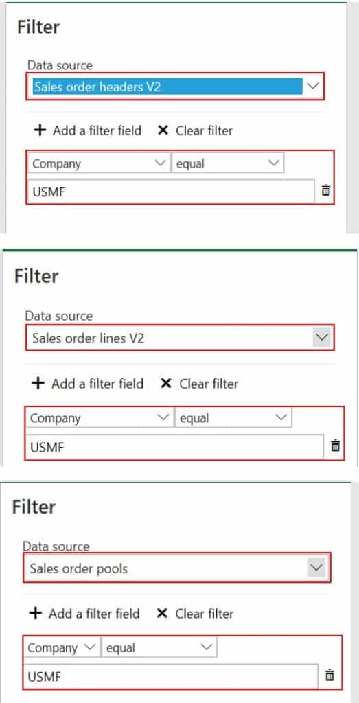
By default, I have pre-filtered the data coming into the dashboard to include only data coming from company “USMF” since this is Contoso demo data. You will need to change the filter for each data entity to be whatever company data you want to bring into the report. If you want data from all companies, you can just clear the filter entirely.
Go to the filter pane as you learned in this article and in the “Data source” field select each data entity and ensure that each one is filtering on the company you want to filter on. Again by default it will be set to “USMF”.
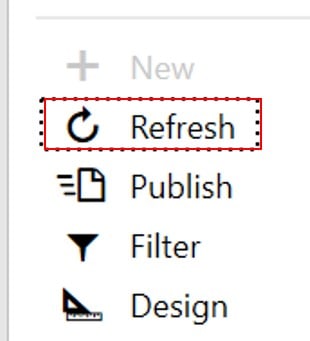
Once you have set your company filter you can click the “Done” button and then click “Refresh”. This will bring in your data into the dashboard.
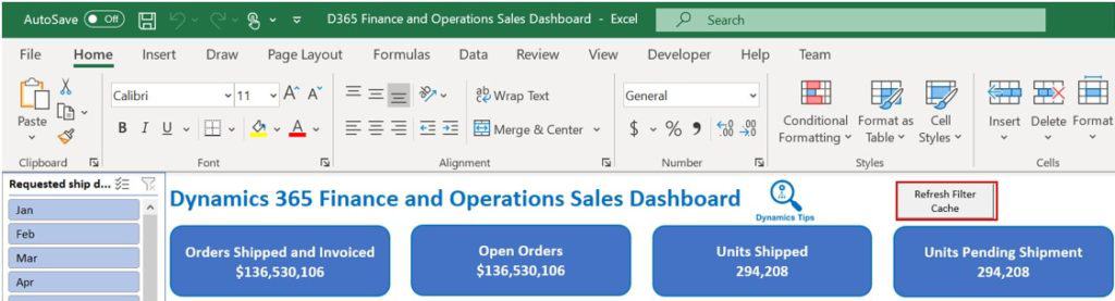
Now that you have your data in the dashboard the last step is to refresh all your chart filters. I built in an automatic refresh macro which refreshes all filters in the workbook. Click the “Refresh Filter Cache” button.
Now all of your data should be in the workbook. By default, all the pivot table tabs used for these pivot charts are hidden. If you want to modify any of them, just unhide the tabs and customize anything you like.
Troubleshooting
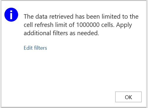
One Million Record Limit
If you have over a million records you will receive an error saying “The data retrieved has been limited to the cell refresh of 1000000 cells. Apply additional filters as needed”. If you get this you need to go back to the filters pane again and set some additional filters (maybe on “requested ship date” in the sales order lines v2 data entity) to reduce the number of records being brought into the workbook.
Slicer Disaggregation
In some cases, after refresh I have noticed that the date slicer disaggregates the dates into individual dates instead of by month. If you want to reaggregate them simply click on one chart, add the “Requested ship date” to the “Axis” of the pivot chart and then remove it. Excel will reaggregate it automatically.
Contact Us
If you are not able to get the dashboard to work with your environment please contact us and provide a detailed description of the problem you are experiencing and we will respond back with the appropriate steps to get it working. Support will only be provided to get the dashboard connected and working. Other inquiries will be deprioritized. Please email contactdynamicstips@gmail.com.
We cannot provide support if you have modified the dashboard in any way from its original form.